Happy Days Clarity Days! Another Step-by-Step Project by Tina Cox! Day 3, Blog 2
Ello ello
Fancying seeing you here! Probably time to start packing up soon, but not quite yet! We have a couple more projects and giveaways!
Here’s a GLORIOUS step-by-step project by our good friend Tina Cox. She’s been crafting away all weekend for us, bless her! I hope she’s got plenty of cake and sweets to keep her going…
Tina has again made you TWO epic projects. I’ll showcase one here in full… Her favourite of the two “because it’s got sequins”. Duh. Tina loves her some sparkles and bedazzling! And I’ll share her blog post of the second project, as I did on yesterday’s blog.
But now ladies and gentlemen, drrrrrrrrrrrrrrrrrrum-roll please…
PROJECT #1

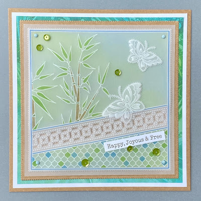
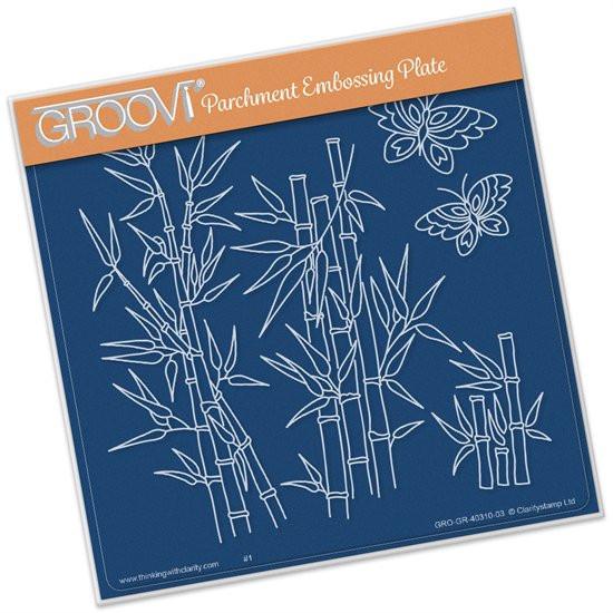
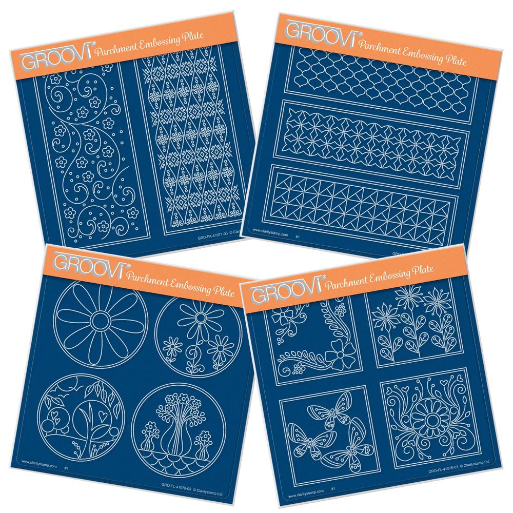
This was Tina’s first groovi plate that she designed, the Bamboo plate!
RECIPE
INGREDIENTS
- Groovi Plate Starter Kit Deluxe GRO-SK-40571-XX
- Word Chain Alphabet Groovi Border Plate Mate GRO-MA-40559-13
- Nested Squares Picot Cut Die Set & Groovi Plate ACC-DI-30698-66
- Bamboo A5 Square Groovi Plate GRO-GR-40310-03
- Large Lace Netting A5 Square Groovi Plate GRO-PA-40339-03
- Straight Basic & Pattern No.1 Groovi Border Piercing Grids GRO-GG-41018-14
- 1mm Pergamano Ball Tool – Extra Small PER-TO-70011
- 1.5mm Pergamano Ball Tool – Small PER-TO-70004-XX
- Embossing Tool 1.2mm Shader PER-TO-70003-XX
- 1-Needle Bold Perforating Tool PER-TO-70028-XX
- 2-Needle Bold Perforating Tool PER-TO-70279-XX
- Pergamano Ringlock Scissors PER-TO-70041-XX (or Pergamano Exclusive Pointed Scissors or Perga Cutter – curved)
- Perga Liners – Combi Box PER-CO-70063-XX
- Dorso Oil PER-CO-70066-XX
- Perga Colours Exclusive PER-CO-70060-XX
- Clarity Lightwave LED Light Panel + Free A4 Translucent Piercing Mat ACC-LP-30352-A4
- Groovi A5 Parchment (20 Sheets) GRO-AC-40020-XX
- Groovi Guard GRO-AC-40345-XX
- Groovi Sticker Tabs GRO-AC-40437-XX
- A4 Translucent White Super Foam GRO-AC-40603-A4
- A4 Picot Foam GRO-AC-40625-XX
- Perga Glue PER-AC-70133-XX
- Pastel Mix Pergamano Brads PER-AC-70270-XX
- Indian Summer Duet Designer Paper ACC-CA-30524-88
- Kraft Card Blanks 6″x6″ X20 ACC-CA-30753-66
- Barbara’s Words Sticker Collection ACC-SC-30849-A5
INSTRUCTIONS
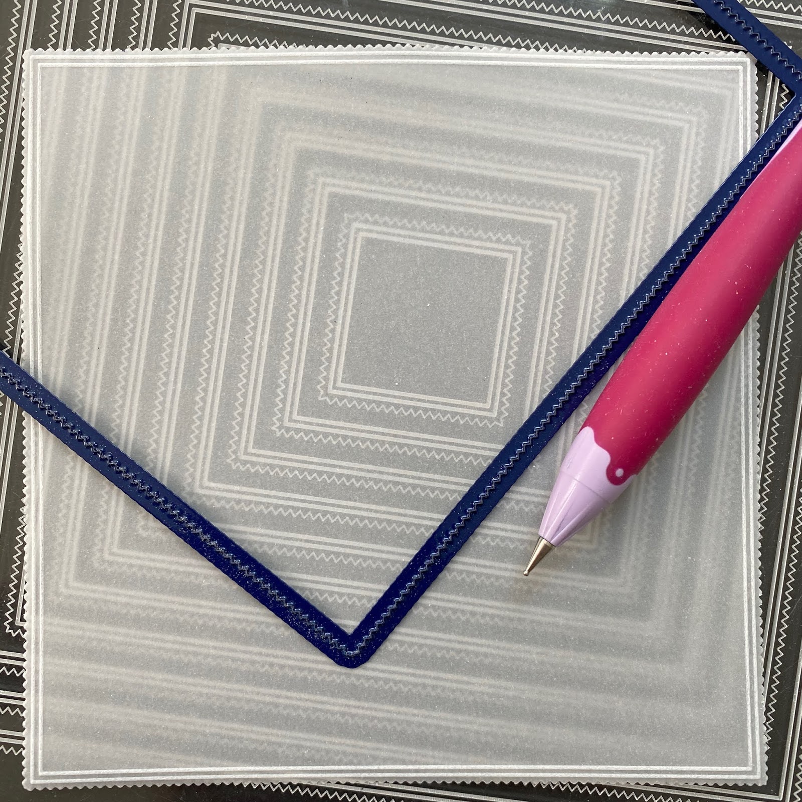
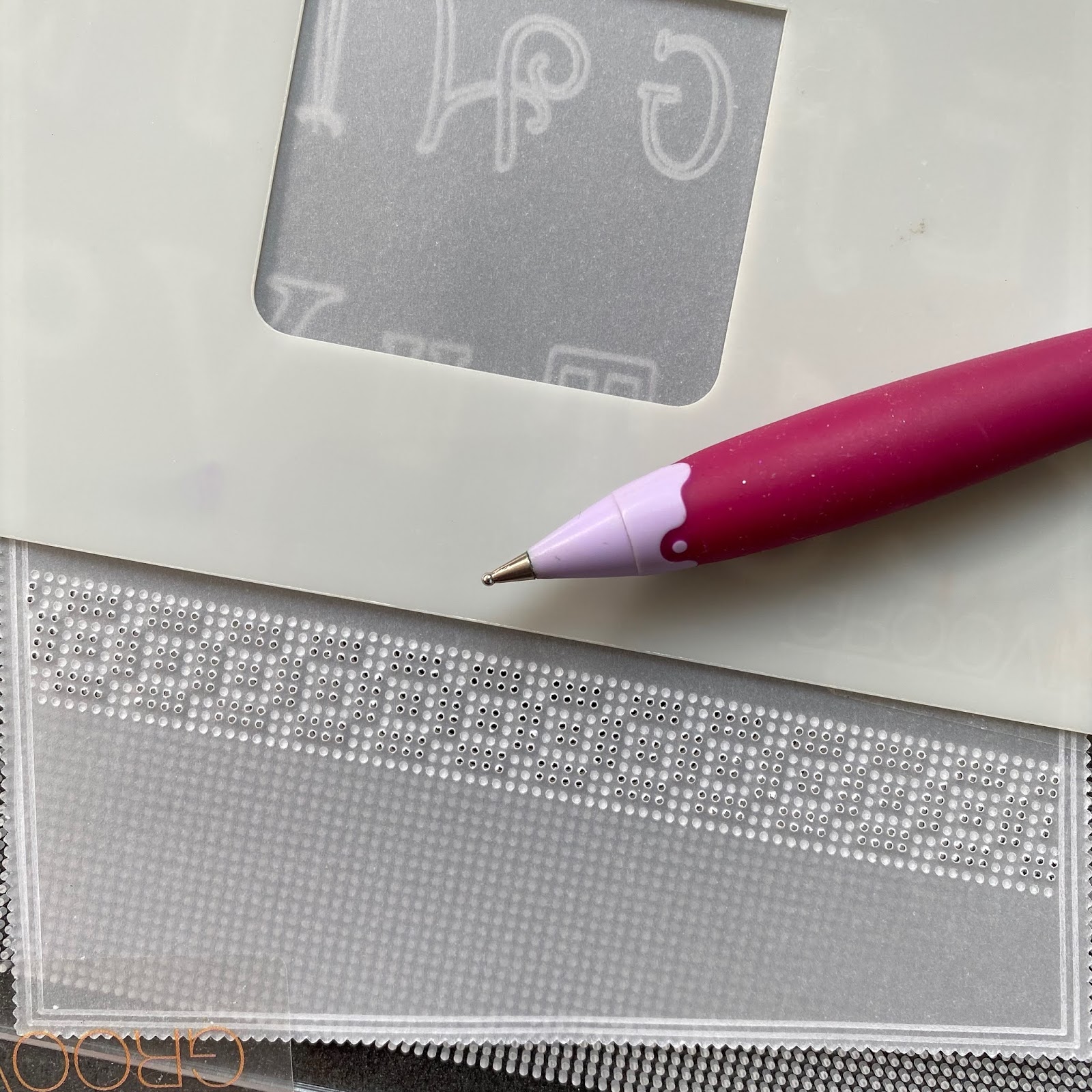
Step 1: Die cut the 4rd largest nested picot square on regular parchment paper using the Nested Squares Picot dies. Emboss the double outline from the matching Nested Picot Squares Groovi plate using the 1mm embossing ball tool (or Groovi No.1).
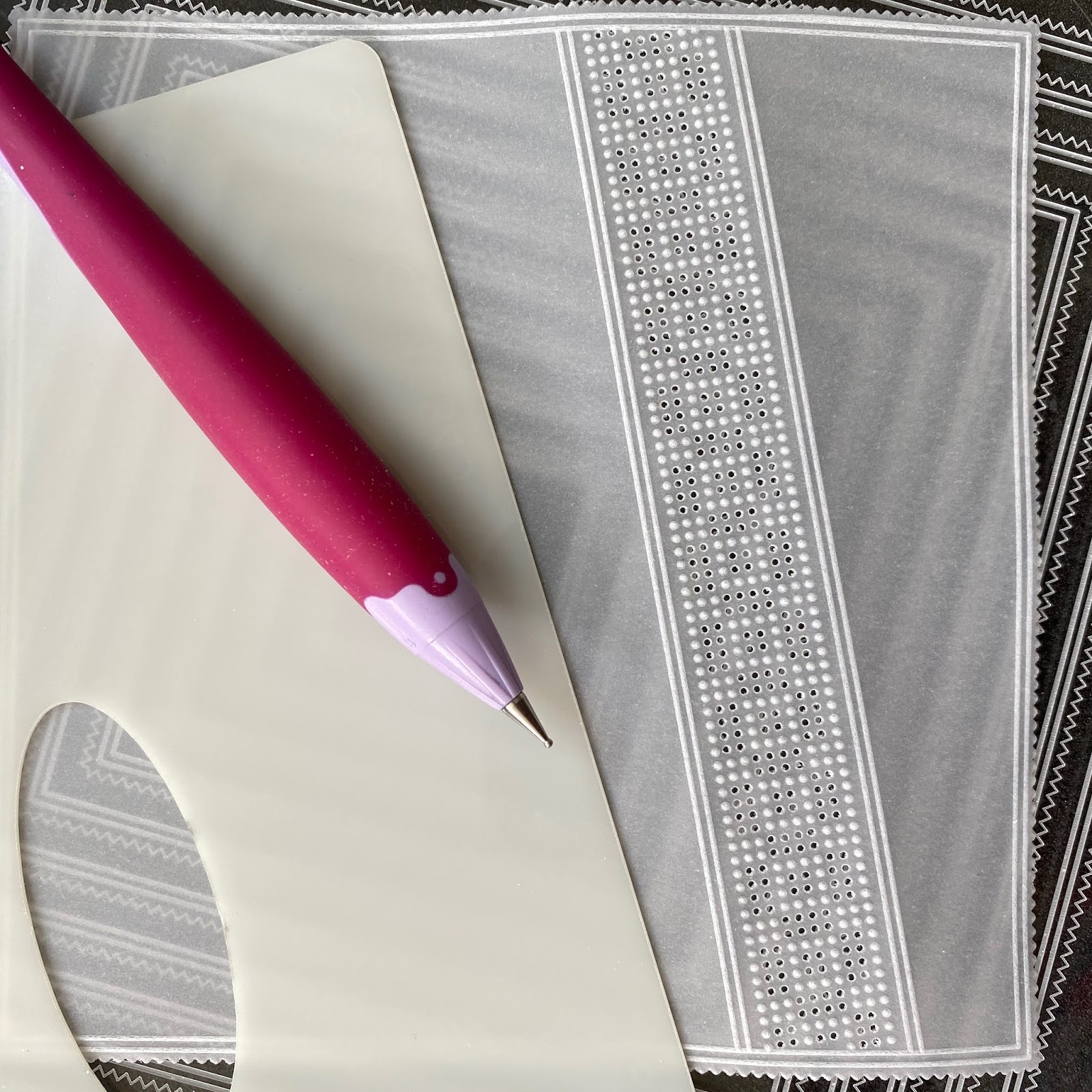
Step 2: With the front side up, using Groovi tabs, stick the parchment over the Straight Pattern No.1 Groovi Border Piercing Grid plate and perforate the border pattern using the 1-needle bold perforating tool.
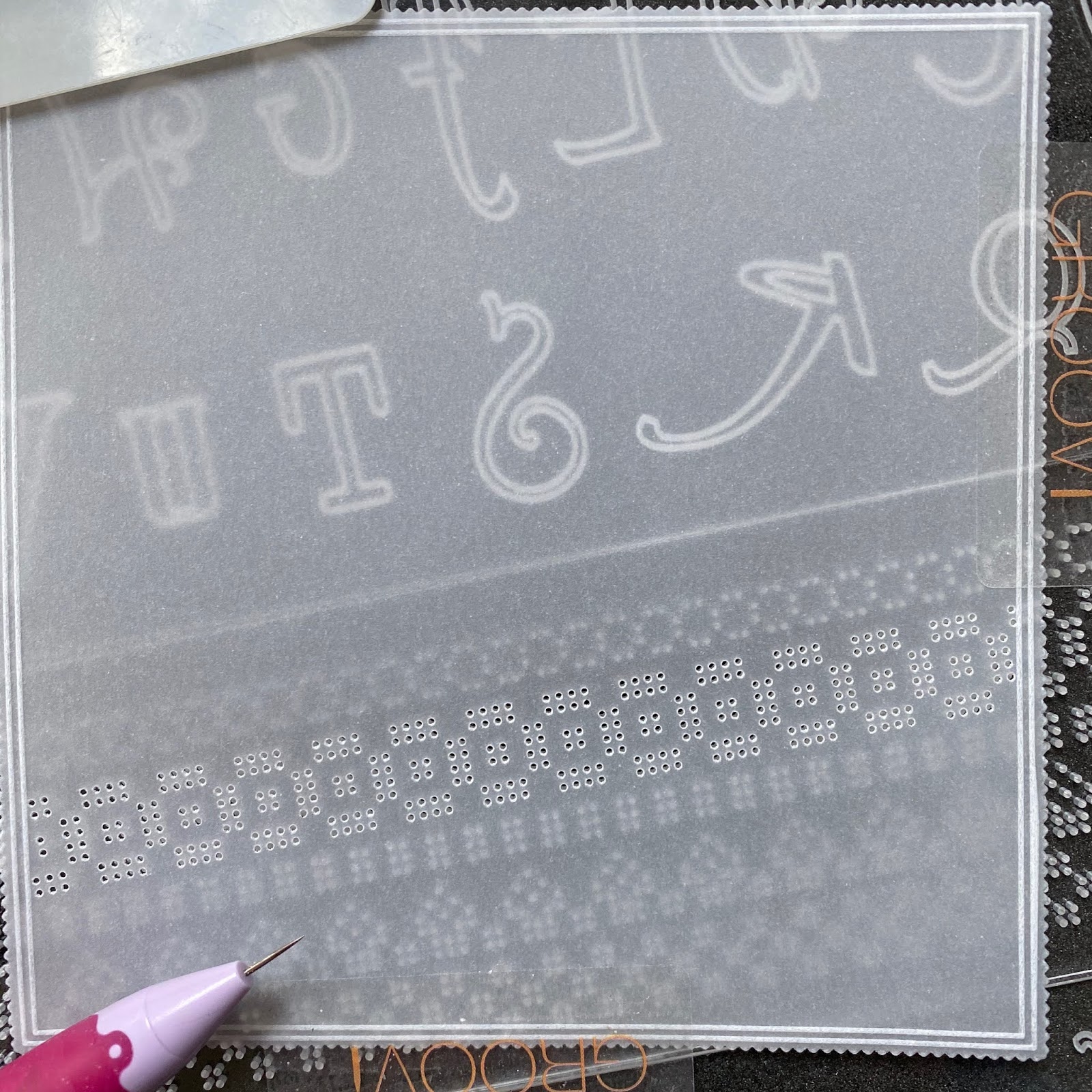
Step 2: Remove the parchment, turn it over to the back and stick it over the Straight Basic Groovi Border Piercing Grid plate. Emboss dots between the perforations using the 1.5mm embossing ball tool (or Groovi No.2).
If you want to learn more about using these straight and diagonal lace pattern border grids there are iibooks to help you along with lots of inspiration for different ways of using the grids.
The bundle for the 4 books can be found HERE 🙂
The bundle has a beginner book and an intermediate/advanced book for the Straight Pattern No.1 Groovi Border Piercing Grid and a beginner book and an intermediate/advanced book for the Diagonal Pattern No.1 Groovi Border Piercing Grid.
For individual iibooks, look HERE 🙂
Right, back to it…
Step 3: Use the Nested Picot Squares Groovi plate and the 1mm embossing ball tool (or Groovi No.1) to emboss a double outline on either side of the lace design.
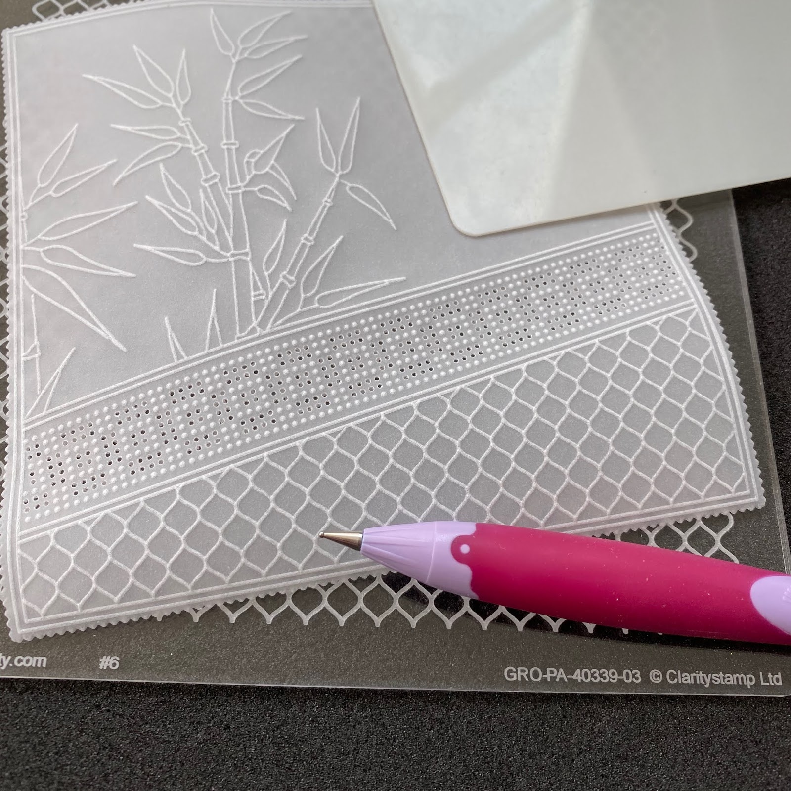
Step 4: Emboss the bamboo from the Bamboo plate using the the 1mm embossing ball tool (or Groovi No.1).
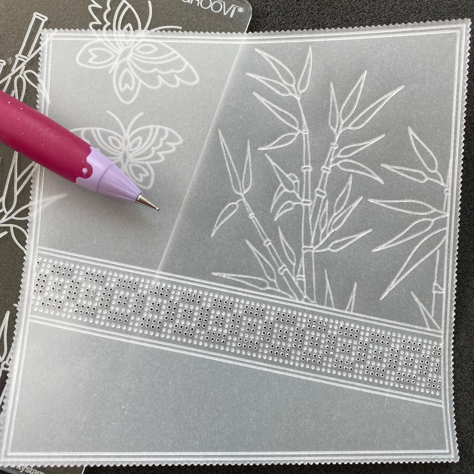
Step 5: Emboss the netting from the Large Lace Netting plate using the the 1mm embossing ball tool (or Groovi No.1).
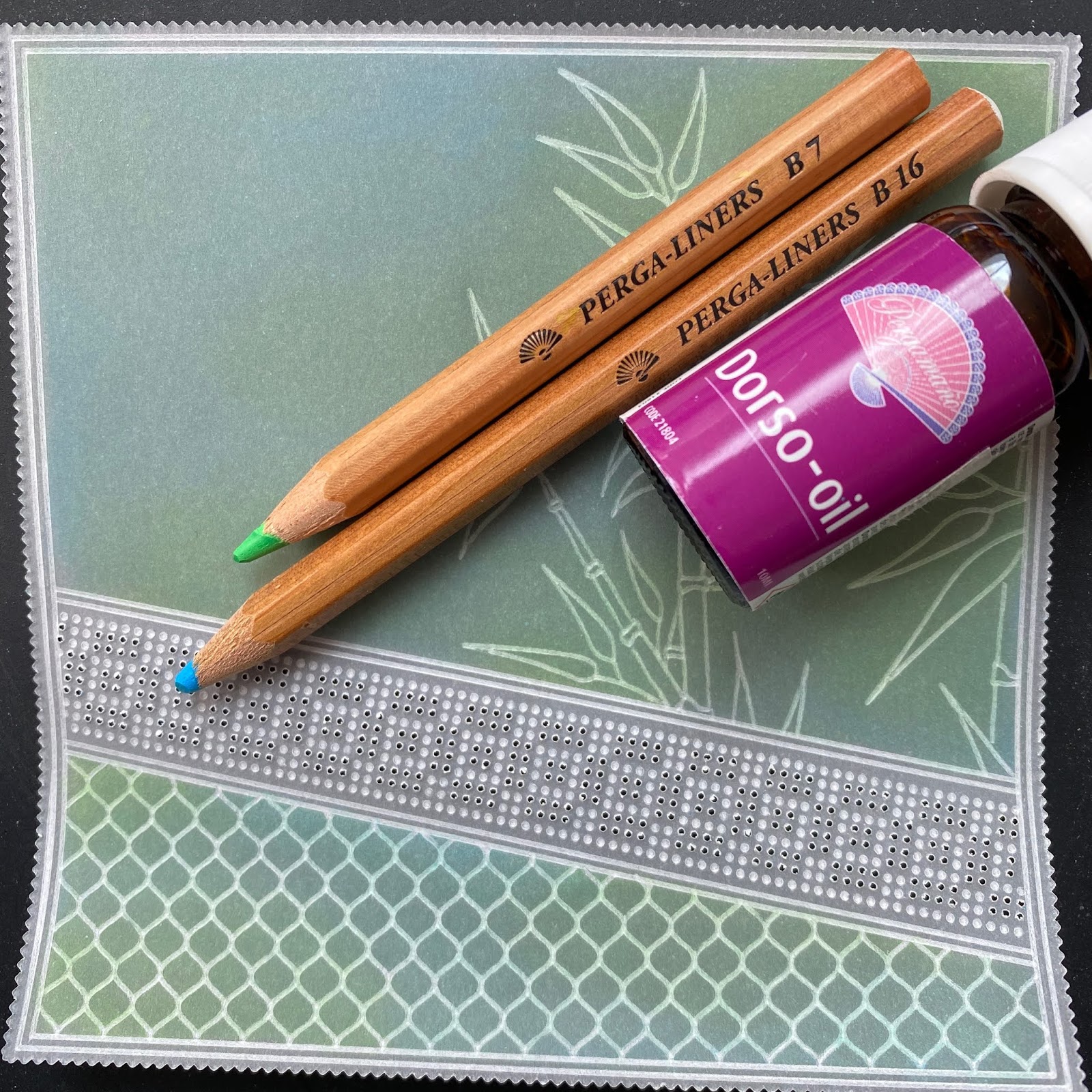
Step 6: Still working on the back, colour on either side of the lace panel using Perga Liner B7 and B16 pencils. Using a piece of kitchen roll folded into a square, followed by diagonally to bring it to a point, blend the colours using a small amount of Dorso oil.
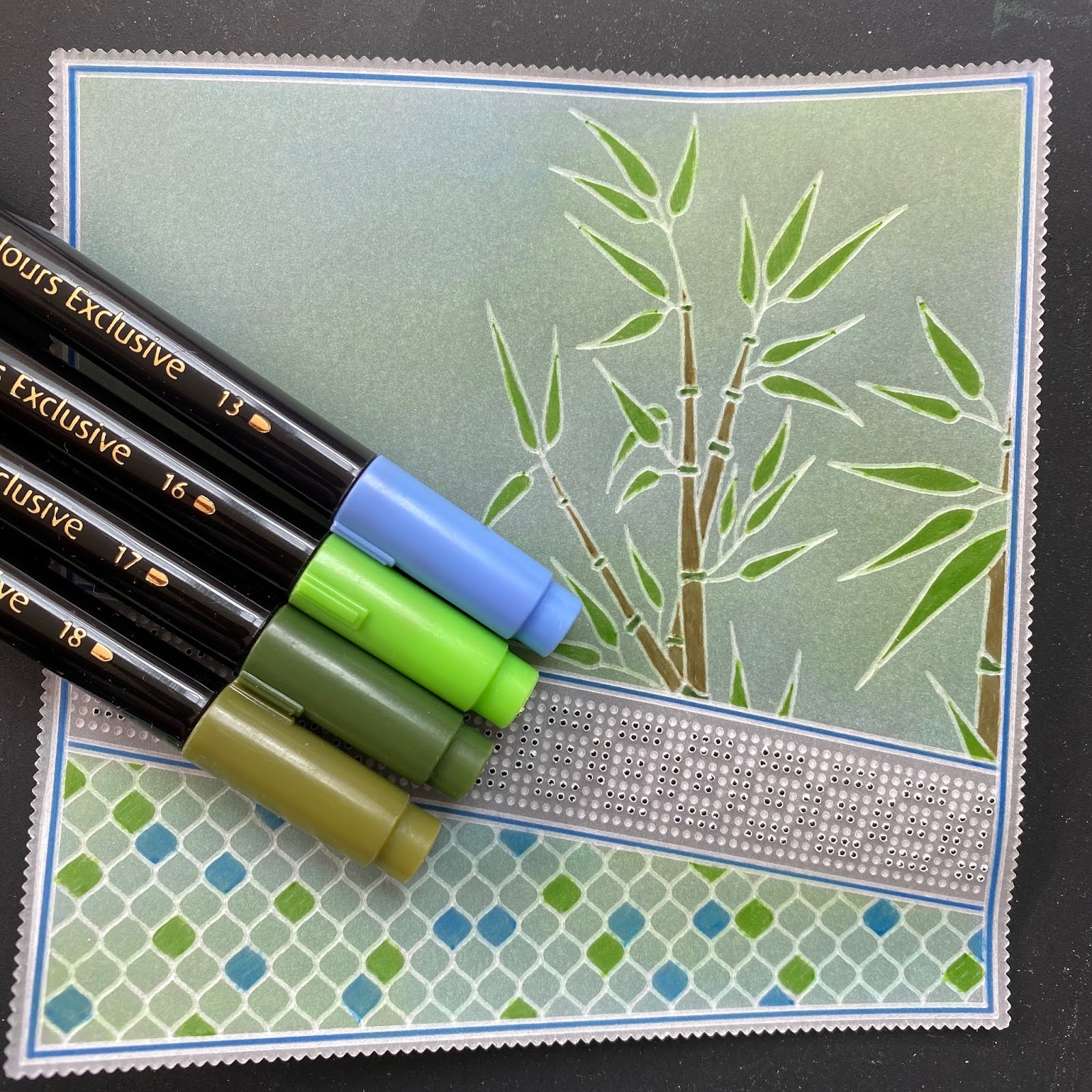
Step 7: Once the oil has evaporated and the work is completely dry, on the back, bamboo, parts of the netting and between the double outlines using Perga Colours Exclusive pens, PCE13, PCE16, PCE17 & PCE18. Let the colouring dry otherwise the colour will smudge.
Step 8: On a spare piece of parchment, emboss the 2 butterflies from the Bamboo plate using the the 1mm embossing ball tool (or Groovi No.1).
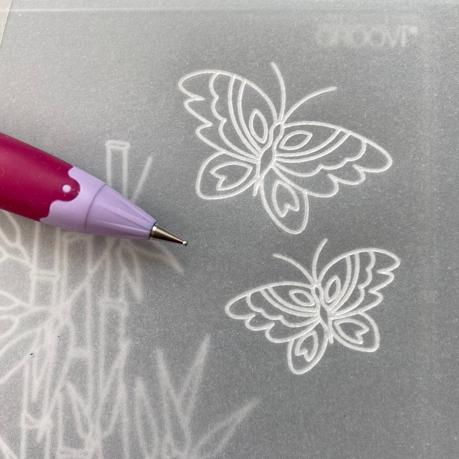
Step 9: Freehand emboss inside the wings and body using the Pergamano shader tool.
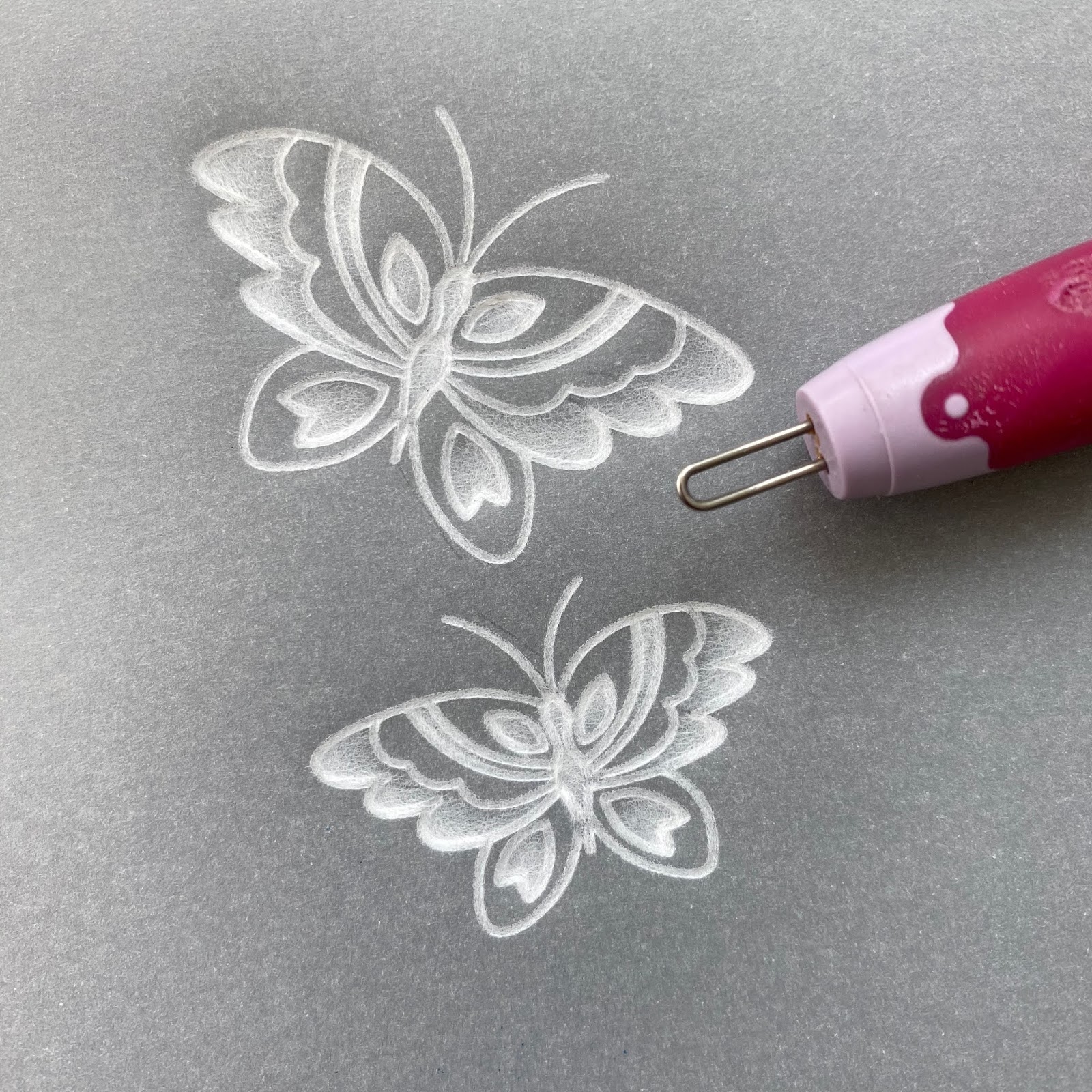
Step 10: Turn the parchment to the front, using the 2-needle bold perforating tool, perforate outside the butterflies.
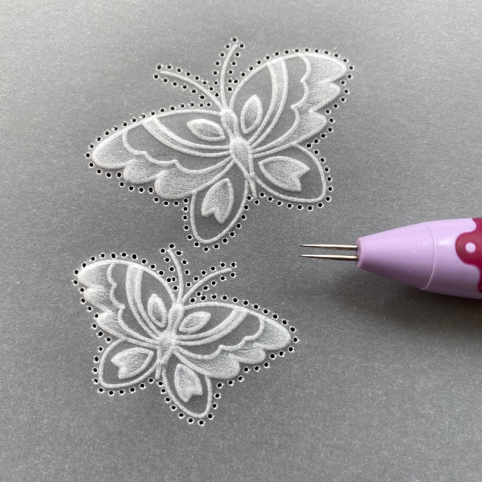
Step 11: Picot cut between all the perforations making sure the scissors are over the waste when you cut.
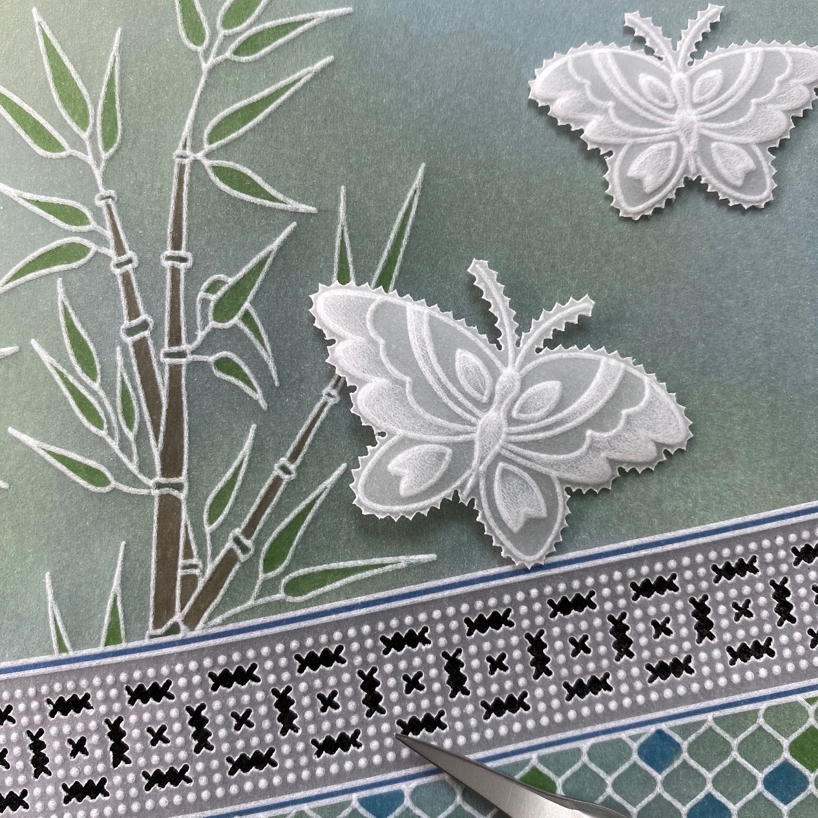
To Finish: Mount the piece on Kraft card picot cut using the 3rd from outside die and a piece of parchment 12.5×12.5cm using brads.
Stick this on Indian Summer designer paper 14x14cm, 14.5×14.5cm white card and 6″x6″ folded Kraft card.
Stick the butterflies on using a teeny tiny amount of Perga Glue on the back of the butterfly bodies. Stick a word sticker and some sequins.
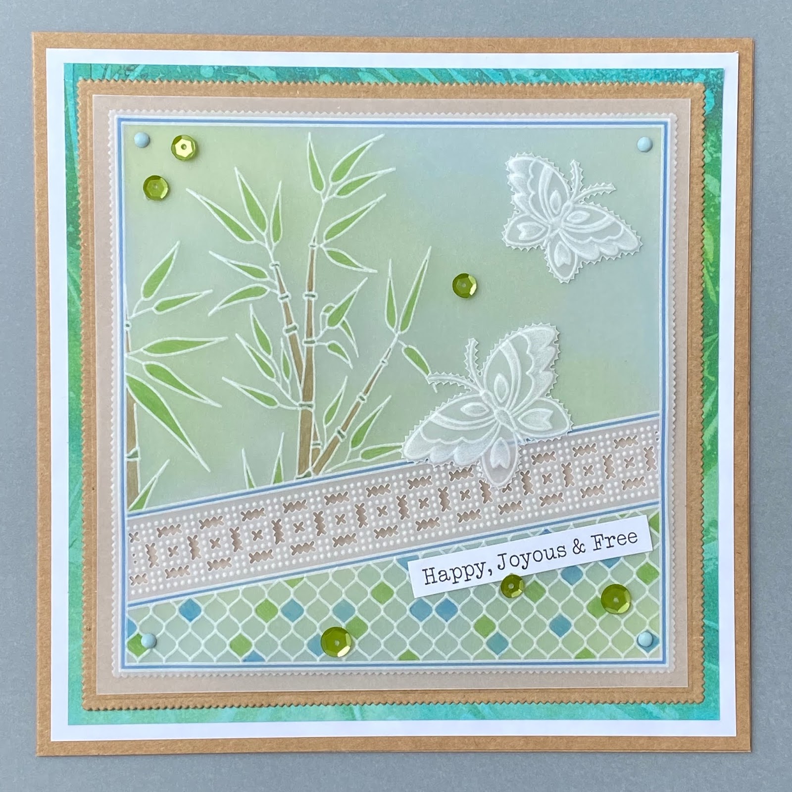
Thank you, Tina! That is a stunning card, don’t you agree? Happy, Joyous & Free indeed!
You can find Tina’s second project beautifully displayed HERE.
2 more giveaways from me today! This give-away has to be something Tina-esque… so here we go. I LOVE this set.
So… if you want to win this fantastic Groovi set, leave a comment below telling me what your favourite colour is and why and I’ll pick three winners. Mine is teal, teal everything… because it’s calming. According to ol’ Google, this is what teal symbolizes…
Teal: A more sophisticated version of turquoise, teal signifies trustworthiness and reliability. It promotes spiritual advancement and commitment.

Ayyyyyyyy! Thanks google. Sophisticated, trustworthy, reliable, spiritual and committed. Pretty spot on, if I do say so myself! hahaha… except perhaps sophisticated 😉
What’s your fave colour and why? Tell me in the comments for a chance to win!
Lotsa love, Grace xoxo
Clarity – The Home of Art, Craft and Well-being.
Green has always been my favourite colour – most shades. I’m also now drawn to
Lilac for some reason. No need to put me in the draw as I have these plates. Must get my i books out thanks for the reminder. Thanks for a fun weekend too xx
Hi Steve
My favourite colour is blue i have loved it since i was very young.
Some one once told me that when you do the colour test blue isn’t mine but i have never believed them.
I still wear lots of blue in clothes and in jewellery.
Love Tina’s work.
My favourite colour is blue any shade. A very dark blue always looks good for Christmas cards but pale blue can be so delicate.
My fav colour is red. Once it catches my eyes I can’t move on. I love it’s vibrancy, energy and heat!
Cobalt blue is my favorite … I think blue will just always be a favorite it was my mothers favorite and I just followed suite … but the cobalt is just so vibrant and true 🙂
Navy blue. My first flat had a bright turquoise carpet and I got things to tone it down. Now I am blind, navy covers all sorts of sins in clothes and everywhere. I liven it up with lime green etc.
Thank you for yet more astonishing work from Tina. The number of layers of colouring on the butterfly of the second project is astonishing but I’m definitely going to try it! I like that it is combined with a die as I am a slow maker. Just as well the sale is on as now I need bamboo, netting…. What a great weekend.
Blue is the colour! All shades but mostly sky blue because nothing beats a cloudless blue sky 😊
Blue is my favourite colour. It has always drawn me to it in all its wonderful shades. When I was younger and made clothes they would always have some blue in the fabric somewhere, not deliberately but somehow I must have been drawn. Then in the 1990’s when I bought my first home I painted the kitchen bright blue, so cheery in the morning when the sun shone through the window. Now I craft and have noticed all the cards I love the best have blues in them. I feel now as if the blues draw me to nature: the sky, the sea and it gives me a sense of well-being and calm. It’s the colour that makes me enjoy life to the full.
Pink to make the boys wink is such a lovely colour
Hello Grace
I like colour, all colour. But my favourite, I think, is purple. All shades and hues from the palest, softest lilac to the strongest of regal purple.
Thank you for this weekend I have thoroughoy enjoyed it.
Love
Roz.xxx
Yellow- it always cheers me up!!
My favourite colours were always Red, Blue and Yellow and I was torn to pick my favourite. But now they all take second place as teal has become my favourite.
Teal has a richness and depth to it that makes you feel so warm and cosy inside. Teal is the first colour I reach for be it in ink or pencil or paint. I feel inspired to create as soon as I pick up the colour.
I think my favourite colour is lilac as it a soft colour
Purple and pink love to use these colours in Parchment for projects useing Tina’s amazing Groovi plates x
Happy Days, Clarity Days.
My favourite colour is yellow because I find it so uplifting. I am on my second yellow car and it never fails to make me smile!
Thank you all for a great weekend.
I’ve always said my favourite colour is light blue, but to be honest, I love so many colours it’s hard to say just one is a favourite!
pale pink – reminds me of my carol roses in my wedding bouquet – 51 years ago.
Since I was a child, purple has been my favourite, but I also love cobalt blue and teal.
Thanks to you and Tina for these gorgeous projects.
Please do not include me in the draw for this prize, as I already have this set of plates.
Thanks! X
Lilac is probably my favourite. When I looked up the meaning of lilac, it said white lilacs symbolised purity and innocence and blue lilac, passion and love! What do you know? Those colours are among my favourites in the garden. I already have the plates so no need to put me in the draw. Hx
Hi Grace!
I really love Ochre/mustard. It’s such a warm colour whether on paper or in clothing. I love it mixed with grey, black, teal & blue. A happy colour for me! Xx
Love Tina’s beautiful butterfly on the second project, amazing colours
Purple – love the colour, and makes you feel vibrant when you wear it! Usually end up making cards with loads of purple in them!
Funnily enough I used one of those butterflies this morning on a friend’s birthday card.
My favourite colours are in the pink and purple ranges.
Thank you for all the fun this weekend. x
Lavender, makes me feel so calm & peaceful
Peaches, cream and ivory for the delicate plates like Linda’s new tri folds x
Dear Grace. I have always loved blues, reminds me of the sea and blue skies. But I also love purples and lilac especially in flowers. I am frustrated as I can’t sign in , don’t know why. I think I will just have to order anyway. It has been a wonderful weekend, with all the great photos of cards. And all the tuition, hoping to have a go at them . I have always wanted to get to the open days but never managed it. I don’t think I will as I am not as mobile as I used to be. Hope you are not all worn out now. Such wonderful prizes your kind Mum has been giving.
Thank you all for such a wonderful three days
Blue and all shades of that colour. Blue skies, blue sea, cosy navy blue scarf when the smow is falling. When i was a bridesmaid at 15, Iwas in ice blue satin. My own bridesmaids were in rich blue. So it has lovely memories.
Fantastic virtual open day – well done to everyone and thanks for all the enjoyment you have given us.
Like you Grace dear, I also like teal, turquoise, aqua and all the colours in that range. I’ve always loved them since my grandma gave me a turquoise necklace for my 21st birthday (many years ago!!) and the colour always reminds me of Granny, whom I loved very dearly and miss her the most. She taught me so much, including knitting and hand sewing and was the start of my interest in crafts.
As a watercolourist cobalt blue is my fave colour. So pure, so blue and so expensive! Perfect for capturing a summer sky.
All pastel colours plus amethyst, deep burgundy, scarlet, emerald and all the blues. Howzatt!!! Already have these plates so no need to put me in the pot.
My favourite colour is pastel pink. Guess it stems from my childhood as my Mom made a beautiful smocked dress for me that was pastel pink and I just loved it. I was so happy to have a little girl myself and always tried to dress her in pink as well.
RED – love the colour, it also signifies lots of good and bad things the two parts of EVERY human being,
Passion, desire, sensitivity, joy, strength, willpower, determination, assertiveness, but also anger, danger,rage, stress.
Thanks to Clarity for taking such good care of us through this crisis, especially your Mum and the SHAC SHAC.
Hi Grace,
My favourite colour is green, reminds me of all the nature that surrounds us!
Hi Grace, my favourite colour is blue – I don’t have any particular reason it just is.
Yellow because its a happy colour
Hi Grace
My favourite colour is turquoise x
Blue – because there are so many different beautiful shades and blue is the colour of the sea, the sky and my husband’s eyes……….
Blue – first time I was allowed to choose the decor for my bedroom I went for blue wallpaper and carpet – 40 years later it’s still the same at M&D’s house 😂
My color is yellow – it has always meant hope and clarity. The color of the sun is hope because the light comes up and always burns away the darkness and brings everything into focus. I have thoroughly enjoyed the Clarity Open Days and think everyone did a fantastic job of making it all so welcoming. Thank you!
Hi Grace,
My favourite colour is Turquoise, but if my little Granddaughter is about I have to say yellow. As she can’t say Turquoise yet.
xx
My favourite colour is green, the colour of spring, of renewal and rebirth.
A big thank you to everyone at Clarity for a wonderful busy weekend during these surreal times,your efforts have been very much appreciated.
#HappyDaysClarityDays
Turquoise/teal for me….it was the colour of my bridesmaids dresses and it always makes me feel happy, serene and creative.
Hello Grace, another great make by Tina, I didn’t know the bamboo plate was one of hers, learn something new every day.
I love the autumnal colours-yellows, oranges and russet reds…sorry I can’t pick just one, but they’re my thing as I love autumn, warmth and thanks giving.
stay safe, Jackie x
Hi Grace
Well Teal is probably my favourite colour too, but I like anything in that range so another one I like is Peacock Blue. Like Teal I don’t feel that it is just one colour but a range of colours within one name. It is a rich, iridescent blue which in certain lights shines through a burst of Teal Green.
I find it a calming yet inspirational colour, rich in a wonderful radiance.
Saying that there are many other colours that I like, I really think it depends on your personal mood and feeling at the time.
Not much longer now,
Love & Hugs
Penny
xxxxxxx
Turquoise is mine, just a gorgeous bright colour, it makes me happy x
Such a pleasant and insightful step-by-step project! Tina Cox’s interest to element and clear education make this an useful aid for all people involved in the craft. The difficult system fantastically unfolds with every weblog post, permitting us to examine and create alongside her. Thank you for sharing your information and passion. Looking ahead to greater inspiring content material like this!