Nice and peachy!
Hi there everyone. How are you all?
I’m gonna jump right into it because it’s fun and exciting – have you seen the new Claritystamp home page? If you happen to have not see it yet (I know, you ALL have) just click here!
Yup, we’ve had a bit of a semi-radical overhaul. It’s a real peach of a design! Barb chose the colour. Could you tell? Plus, it’s quite striking with the new font in a dark black and we really enjoy the fresh feel of it all. Hope you like it too. It’s not just aesthetics, by the way. We’ve updated the layout a bit and are still working on the other pages on the site to make it all much easier to access, navigate, shop, and find creative, Clarity content!
Feel free to let us know what you think about the new look in the comments below. Feedback is always appreciated!
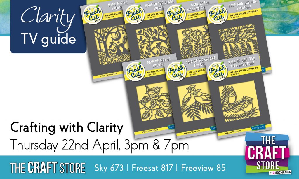
Anyway, there are a few cool things that you need to put in your diary this week! Firstly, we’ve got Crafting with Clarity on Thursday at 3pm and 7pm. You can learn more about that here.
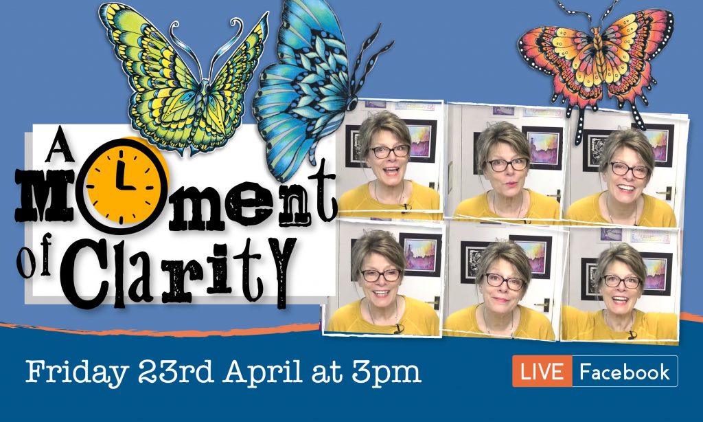
Then on Friday at 3pm we’ve got A Moment of Clarity. Barb is bringing a new show to you featuring some incredible butterfly and moth designs by Cheery Green. As you can see a little bit below, there is real beauty to bring to life with brand new stamps. You can buy them here, and if you order soon, who knows, you might just get them in time to craft along with Barb on Friday!
And the final thing to mention, you may have spotted this already, which is brand new Offers of the Week! Click here for a bit more info! We wanted to bring you content a bit more regularly and give you not just a bit of a discount on a small range of products, but to provide you with MASSIVE savings on products related to some of our favourite artwork and content. This week we’re giving you 50% OFF our SHAC Love designs in Groovi and stamp. There is also some really cool content on our Offers of the Week page and do keep checking back to that page for updates, artwork, and maybe even a special blog post or two by Barb herself. Offers of the Week is something to be really excited about. Weekly offers, huge savings (plus your club discounts), and even new product launches to happen along with creative, crafty Clarity content – well worth keeping an eye on – that’s for sure!

If you want quick access to it from the homepage, we’ve even added a brand new button near the top (at the bottom of the four buttons next to the slider). Make it one of your most clicked buttons and we promise you won’t regret it!
Anyway, that will do from me. Enjoy.
Fantastic improvement in your website. Calming and “peachy” great ideas, projects, prices and fabulous quality as usual, plus a friendly and helpful team at Clarity Towers, thankyou.
Loving the Facebook crafting sessions, all superb and fun.
Love how my order(s) always say “thankyou Kathryn” for your order, beautiful complimentary postcards with all orders, free video rewind available, lots of other tips and tricks online.
Keep up the fantastic work.
Hiya, just love the new site. I am however having problems accessing the inspiration galleries. I’m not sure if there are lots of photos/examples on there but I only ever see the first one, ie Africa and I click on gallery and nothing else comes up.
I did have a slight brainwave and it’s probably something that would be too onerous a task but I wondered if it would be at all possible to add a link to the plates/ dies/stamps and stencils that there is a video demo of so that you can see how to use it before you buy it? I’m sure it’s already been thought of but just thought it might be a good idea.
Have a great week
Hi there,
have you given it enough time to load? I had no problem getting the examples but it takes perhaps 15, 20 seconds. Wish you success – Jutta
Yes I did wait, but all I had was the wirring circle in the middle
Yes, I get the ‘whirring circle’ as well, but if you wait, it stops and the pictures show.
Good luck!
Hi there Anonymous, or ‘me’ …. (sorry, but there is never a name !)
Good work done on this re-designed homepage, although personally I never had a problem with the old one (actually preferred the font). However, what I am especially thankful for is that I can now get individual items to display on the Pergamano page e.g. It used to ‘annoy’ me (well, just a little) when I wanted to look at Embossing Tools for example, I had to look through the whole range of Pergamano products (18? 20+ pages? can’t remember now). So, it is great that the individual links work properly now – Thank You!
Best wishes, Jutta
I preferred the font on the old site. I think this one makes it look a bit amateurish. But apert from that it’s all briliant
Hi there I did make an order from the site today. I must say it looks fabulous. Have a great evening. Take care. Hugs Jackie
Hi Stuart, Just been to see the new website, it looks great. I didn’t have any problem accessing the Inspiration Gallery.
Thank you for the info on the shows.
Take care, stay safe.
Love from Patricia xx
Hello there
Love what you have done to the website. Lovely layout and fresh light summery colours. Very inviting.
Have to say not a fan of the new font as it’s pretty difficult to read easily. The letters seem to be almost joined and the size of the font makes this hard work to read. I think it’s the curly bit at the start/end of the letters.
Can’t we have the old font as it was or in bold???
The font on here is good too and a lot easier to read even though it’s less bold.
Hugs Jules
x
Thank you for using dark black as the color for the font. As someone with older eyes, it’s frustrating when some young designer wants to get arty and chooses colors that are difficult to read.
Hello! Just had another look at the new site. TBH I didn’t realise it was any different except that the HOME button had gone! That just shows how often I notice anything other than what I’m looking for. It loads more quickly (sometimes it used to time out before it loaded and barb’s blog is very slow to load many times – I guessed a lot of people must be looking at it). I never had a problem with the old site and so far haven’t had any with the new one!
The new design looks fresh but I am not overly keen on the font but that’s just personal taste. May I ask why I am unable to read product reviews left by customers? I always like to see what others think when purchasing from any website. You have many 5 star reviews seems a pity to hide them.
One suggestion I would like to make is that you have a dedicated email address or area on the website for customer suggestions and ideas for possible new products. Not all of us do Facebook but we too have good ideas which might just help your business. I appreciate it’s yet more work but it just might be worth a try.
For me, anything that’s makes things easier is great. I’m not very good at negotiating my way around and like many others in lock down have had to learn by trial and error. So thank you, this all looks veryhelpful.
Yes the new site looks fresh but I do not like the new font, the heavy black is hard on my eyes. Is this a new modern font? It reminds me somewhat of the very old books my Dad had. Some things are easier but overall I think I preferred the old site.
One thing I have never liked is the fact that every time I change a page I get the cookie stripe appearing and it is so annoying. Surely when cookies have been accepted on the opening of the site this is enough.
Moan over.
Still love all things Clarity.
I’m going to scream. The site is now less accessible. Don’t tell me I can ring up because I liked being able to do a lot of things for myself.
Love the new colours and layout. It is indeed “peachy” , but in my eyes Claritystamp can’t put a foot wrong. Been with them since the beginning and consider everyone a friend.
New website looks good, but I’m with a few others on preferring the old font.
I seem to remember from some research we did for a newsletter the charity I work for produces that ‘sans serif’ fonts are more accessible and better for people with dyslexia. Solid black is good though.
For what it’s worth – I think some of the issues other people have been having, e.g. repeated cookie bar loading, perhaps issues with the inspiration gallery, might be down to the settings on their computer/web browser rather than your website.
Thanks for asking openly for feedback 🙂
What’s the phrase- you can please some people, some of the time but you can’t please all of the people, all of the time. I can sympathise with those who preferred the other style but personally I like it- and the peach too🍑
Like the new website – ( I didn’t have a problem with the previous layout/colour).
The new colour is fresh and inviting. Thanks for trying something new😀.